One of the lessons of the postwar art boom is: nothing is safe from the artist’s hands. In the last decade alone, artists have taken to producing their own theater, their own music, their own books, their own records, their own toys, their own maps, their own houses and their own postage stamps.
The genre of artists’ stamps should be distinguished immediately from both the regular, “legal tender” postage issues of countries and from the mail art phenomenon in which many artists have participated in the last decade. The artists’ stamps considered here are not recognized as valid by any post office although several artists have pulled fast ones and gotten their mail through with their own stamps (or with painted or drawn replicas of regular stamps).
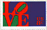
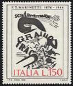
Official issues that reproduce artworks, such as France and Italy have recently been printing, or issues designed by recognized artists, such as Robert Indiana’s 8-cent LOVE stamp or Stuart Davis’s Fine Arts design, are only arguably artists’ stamps (although the argument is persuasive, especially with an example such as the Futurist visual poem by F. T Marinetti which Italy put on a stamp a couple of years ago).
As for mail art, artists’ stamps could legitimately be considered a sub-genre of that large (and admittedly overstuffed and perhaps even overtaxed) category. But it must be emphasized how specific a sub-genre artists’ stamps are; within the dizzying scope of mail art, artists’ stamps are readily isolated. They are designed to function as stamps, in either or both the philatelic and legal tender sense. Whereas makers of most mail art take vast liberties with the forms and functions of their modes of communication - essentially seeking the limit to what the post office recognizes as “mail” - the stamp implies a rigid codification of form and function. At least one of several factors is necessary to identify something as a 'stamp'-perforation, denomination, adhesive, affixation to a posted envelope, etc. An artist’s stamp may be round, unperforated, rendered in tempera and as big as a house, but if it has stickum and a stamp-like price as an integral part of its design, it’s an artist’s stamp (despite the fact that the post office won’t go near it).
The appropriation of the postage stamp format by artists is natural enough: the format is closely related in its imagistic, even heraldic aspects to various concerns of the traditional pictorial arts, and as issued by various lands has contributed to these concerns. As philatelists will argue, stamps are themselves multiple artworks, at the very least accomplishments in the arena of design. The philatelic factor also relates stamps to fine art: collectors have had something of the same Heisenbergian effect on the nature of postage - changing it by studying and desiring it - as they have had on art, despite the essential functionality of stamps. When small countries like San Marino, Liechtenstein, and Tonga regard their postal issues as leading export products and redouble their pursuit of the market, you know stamps have taken on an economic role beyond that of service tax marks. In a sense, artists’ stamps are a means for artists to expand their paying as well as passive audience. But, to be fair, most stamp artists have other things on their mind - more broadly social and conceptual matters - than lucre when they produce stamps.
According to James Felter, stamp artist and curator of the first major exhibition of artists’ stamps, the earliest artist known to produce his own postage stamps was Karl Schwesig. Schwesig, who lived from 1898 to 1955, was German, but was vociferous in his anti-Nazism. He fled to France before the war, and, when Vichy was established, may have worked with the French Communist resistance. Schwesig was imprisoned in the Nazi concentration camp in St. Cyprien, department of Gers, in 1940. In March of 1941 Schwesig found some blank perforated margins from an actual postage stamp sheet and took to them with colored inks, producing at least 27 hand-drawn stamps (24 of which are now in the collection of the Leo Baeck Institute in New York. The stamps, in various denominations, bear the national identification “GURS” and comment on the conditions of life in the camp. (Three satirize the French national motto Liberté, egalité, fraternité.)
There are other early examples of handrendered stamps; all of those of any wide repute, at least, postdate the war and did not come to any sort of renown until the last decade, when the artist’s stamp format was isolated as an area of endeavor. Joel Smith began painting his “postal paintings” in Ohio in 1962. painting on the surfaces of real stamps, and Donald Evans was drawing and painting his imaginary stamps from imaginary places as early as 1957 (when he was only 12). But the only artist’s stamp to gain any attention before 1963 was the “Blue Stamp” of Yves Klein in Paris in 1959. A regular postage stamp painted with “International Klein Blue” at the time of the artist’s exhibition “La vide” (The voi - an empty gallery), it was actually passed by the post office, sparking a typical scandale française.
The earliest known stamps to be printed and exhibited in the context of art are the Yamflug and Fluxpost sheets created by Robert Watts in 1963 and 1964. The sheets are monochrome (some impressions are red, some green. some pink, and some blue) and each consists of a single “framing” format, with the logo at top, decorative filigree in the side margins, and the denomination in both lower corners. Within this border, the images change from stamp to stamp. The 1963 Yamflug issue is a parade of heads from a wide variety of sources, including art masterpieces, old snapshots, antique postcards, advertisements, and girlie magazines. A “leitmotif” running through this sequence is a young man’s head, occurring at irregular intervals, each time with a different expression, as if demonstrating the physiognomic manifestations of various emotions. The 1964 Fluxpost issue presents a wider array of imagery, from a wider array of sources, but heads - obviously drawn from the same sources as mentioned above - till predominate. Another 1963 issue breaks the pattern by bringing together stamps in two formats - square and rectangular - and several denominations and identifying legends (“Safe Post”, “Jock Post”, “K.u.K.Feldpost”). The imagery, however, is similar to the other issues (if somewhat raunchier overall). The stamps were made available not only as sheets, but in stamp-dispensing machines; a dime bought two stamps (or one of the oversize “Safe Post” rectangulars). Such machines were sporadically on exhibit in New York during the 1963-64 art - season; I recall encountering one at the Thibaut (now Fischbach) Gallery in December of 1963, as part of an exhibit organized by Nicolas Calas including Robert Morris, Walter de Maria, George Brecht and others, called “The Hard Center.” and in a back room at the Pace Gallery in February of '64. Watts exhibited objects in a four-person show (with Richard Artschwager, Christo, and Alex Hay) at Leo Castelli the next month, and sheets of his stamps were available in the gallery office. It was also that month, incidentally, that the Feigen-Herbert Gallery sent out sheets of stamps as announcements to a show of paintings by Kirsten Kraa. The sheet repeated a single, typical Kraa image, a humanoid figure rendered in a flat, naive style seated before a plate of fish.
The “Hard Center” show included artists who were forging a “new sensibility” (to use Dick Higgins’s term), a sensibility which was to lead to what Lucy Lippard was to call the “dematerialization of the art object” - into concept, environment. activity, and situation. Watts was at the core of the new sensibility; indeed, he had printed the stamps as part of an ongoing, year-long sequence of “Yam” creations and spectacles (so-called because the sequence began in May - “Yam” backwards - of 1963 and ended the next May) inwhich he and Brecht were involved. The Yam activities were themselves an aspect of Fluxus, the first concerted effort to bring together various of those artists helping to create the new sensibility into something like a movement. Besides the Yam events, Fluxus sponsored many performances and situations, in New York and Europe, during its “golden age” of concentrated activity (1962-67). At least as important were the publications and multiple objects published by Fluxus mastermind George Maciunas for various of his compeers. Among the most intriguing and challenging of the Fluxus boxes and printed material are a goodly number of group efforts, collations by Maciunas of contributions in various formats by various artists. The one especially relevant to the topic at hand is the 1966-67 Fluxus Postal Kit. Like most of the Fluxus multiples the Kit is a handsomely and cleverly designed object-anthology, the contents of which vary from copy to copy. Three items are in every copy: the box containing the kit, bearing a photo of a mailbox on its front; various sheets of Watts stamps (normally the Fluxpost sheet, which Maciunas helped publish) and an Official Fluxus Cancellation Stamp (containing the legend “Inconsequential is Coming”) by Ken Friedman, perhaps the first artist’s stamp-cancel. Some Kits also contain a Ben Vautier rubber stamp (“Ben certifies this to be a work of Flux-art”), a Watts - Brecht Yamfest postcard, postcards from the “Monsters are Inoffensive” series printed in France by Robert Filliou and Daniel Spoerri, or any combination thereof.
Also in 1966, that “honorary member” of the new sensibility, Andy Warhol - whose multiple-image Pop paintings often resemble stamp sheets - created a non-denominational sheet of stamps as the cover of the literary magazine Some/Thing #3. On each stamp the legend “BOMB HANOI” floats in the middle of a yellow orb. In exact terms Warhol’s was not a postage stamp, but a “campaign” stamp, the kind that political or other special interest groups publish to affix to letters (e.g. Easter Seals). As I recall, Warhol has also done a painting of a sheet of S&H Green Stamps.
Alex Hay - also a new sensibility “fellow traveler” in New York - has done several large paintings of single Green Stamps. Other artists, of course, have incorporated trading stamps into collages. I know of no artist who has actually published his or her own trading stamps - at least not yet...
Since the Fluxus activities of the early and mid-60’s the artists’ stamp genre has burgeoned - not least by the efforts of Fluxus-associated artists themselves. Before his death in 1978 George Maciunas printed several 42-stamp sequences as sheets; labelled “Fluxpost”, the denomination of each stamp increases in orderly succession, left to right top to bottom. The photographic images “increase” too: each image amplifies the intensity of the last. In one sheet, for example, male portrait heads from the 19th century are arranged progressively by apparent age. (After the first few callow youths, age is measured by length of beard.) Dieter Roth - not an official Fluxus member, but closely associated with the group - produced a striking sheet of color variations on a racing car image (rendered in Roth’s deft and ornate linear style) in l972. For his part in 1974, Ken Friedman made a stamp of two rubber stamp images, his own “Fluxus West” cartouche (designed by Wolfgang Feelisch) and the “Fluxus Zone West” cartouche Joseph Beuys coupled with Friedman's. The postage stamp features the two rubber stamps surrounded by the legend “Fluxpost Commemorative Issue” and a cancellation mark reading “Fluxpost West 1964-1974” is printed on every sheet.
The “Fluxpost Commemorative” marks Friedman’s retirement from the directorship of Fluxus West, but only incidentally; in fact, it was commissioned by James Felter for the Artists’ Stamps and Stamp Images show being compiled at the time at Simon Fraser University in Vancouver, British Columbia. The exhibit began travelling two years later, and continues to this day, its catalogue expanding selectively at every stop. Other artists’ stamp exhibits have been held since - one was assembled in 1978 by Al Souza for Smith College in Massachusetts, for instance, and one was collated the next year for Stempelplaats in Amsterdam by Ulises Carrión - but these have more or less emulated the “ephemeral” nature of the mail art context, while Felter’s show builds documentation on the stamp phenomenon itself. In fairness, Souza’s and Carrión’s gatherings brought to light material that Felter had evidently not yet encountered. But, despite its many ellipses and omissions, Felter’s exhibit is a work of scholarship, and its catalogue - printed on heavy stock sheets prepared for looseleaf binding, like pages from a stamp album - is a handsome, valuable, and infinitely flexible document.
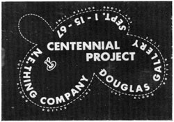
There is, not surprisingly. a Canadian bias to the show. But it’s a bias Canadians have earned. Beginning with the resourceful lain Baxter, whose “N.E.Thing Co” created a stamp for its “Centennial Project” show in Vancouver in 1967, Canadians have been very active in the creation of false stamps and stamp-derived graphic images.
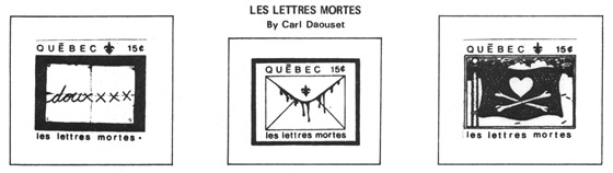
Toronto’s lively Coach House Press alone has been responsible for a broad assortment of stamps and offset stamp images, including the Johnny Canuck issues of 1971-73, depicting scenes from the adventures of Canada’s comic-book hero. Quebecois Carl Daouset realized a droll set of lettres mortes in 1970, troping on the idea of the “dead” (or at least “dying”) letter - and attributing his issues to Quebec, complete with fleurs-de-lis, rather than to Canada.
Felter’s own 1974 “Canadada” image, a linear and geometrically stylized maple leaf, has become a prototype for many of his subsequent stampworks. For a sheet he published with Ecart Publications in Geneva, Switzerland, in 1976, Felter rendered a stylized Swiss cross and the legend “Helvedada;” to the anthology sheet Souza edited for the 1978 Smith College show, Felter contributed an optically active ziggurat design and the label “Lotusland”. Anthology sheets, it should be noted, are becoming increasingly popular, both as publications accompanying stamp shows and as items in their own right, handy means to owning, displaying, and circulating artworks by dozens of artists at a time. Vancouverite Edwin Varney - whose own sheets lacerate maps of his home town with grids of perforation - has produced several lively anthologies.
In the United States the current spate of stamp activity goes back to Joel Smith’s persistence in rendering his paintings on stamps - a persistence rewarded between 1967 and '69 by a teaching stint at Simon Fraser University. There Smith mounted his “Smallest Documented One Man Exhibition in the World” a single stamp painting mounted on the back wall of a scale model of the school’s stage. William Farley may never have made it to Vancouver, “artists’ stamp capital of the world” but his work dates back at least to 1970, when he created a variation on one of the first American stamps, the George Washington X (10c) - replacing Washington’s head with the back of his own, complete with long hair pulled back in a hippie ponytail. Farley was apparently taking the satirical image of Washington with a crewcut (“Keep America Beautiful - Cut Your Hair”) one step further. Three years later Farley coupled this image with an anti-Nixon political cartoon (by Conrad of the Los Angeles Times) in a four-square plate block, adding the legend “Get him the hell out” and signing it “The people”. Such vituperation isn’t surprising, considering the threatening visit the Secret Service paid Farley shortly after his original stamp passed in the mails.
If some artists, stampmakers and otherwise, protest existing social and political conditions, others just leave them behind for ideal (or at least bucolic) lands of their own imagination. Currently, Philadelphian Jerry Crimmins is fabricating and perfecting “La République de Rêves”, a multi-lingual Surrealist state (“Liberté, Amour, Poésie”) located “between the Sea of the Unseen and the Sea of Clouds, on the island Polis Poieton” (according to the recently published Visitor’s Guide to the République) and governed by poets and artists. [The Republic of Dreams]
The stamps of the République, like its coinage, paper money, official seals and other governmental issues and emblems, feature dream and fantasy imagery and mysterious conceptual manipulations of this imagery. Homage is often paid to Surrealist artists and writers and to those who inspired them (Baudelaire, Poe, Jarry, Rimbaud, Apollinaire, etc.). If European countries depict their creative geniuses rather than their statesmen on their money and postage, La République de Reves depicts those creative geniuses who are the direct ancestors of its own statesmen.
Another inventor of places, Donald Evans, contributed mightily to the artists’ stamp genre before dying in 1977 at the age of 35, in a fire in Amsterdam (where he had been living since 1973). Especially after his move to Holland, Evans realized set after set of unique, individually drawn and watercolored stamps, all refining the imaginary lands he had been inventing since childhood. Evans made his improbable countries - Antiqua, Amis et Amants, Flora and Fauna, Achterdijk, Etat Domino - far more credible by intimating details of their existence through stamps, stamps which aped the conventions of “real” countries’ stamps with exquisite insight and no little humor. The “1967 Vocabulary Issue” of Dutch-speaking Nadorp, for example, pairs disparate objects and labels them: de nagel (“the nail”) and de piramide are on one stamp, while on another is paired de postzegel (“the stamp”) and de regen (“the rain”) - de postzegel represented by a depiction of itself. Various airborne views of the Tropides Islands the are interrupted by hovering dirigibles in the “1936 Zeppelin Visit” series - of which my favorite is “Leaving the Tropides”, nothing but a blimp out over the high seas.
Robert Fried left behind a tremendously impressive body of stamp-work, too, when he died in San Francisco in the mid-1970's. Fried’s stamps, unlike Evans's, were printed, but their images are so finely rendered and their colors so vivid that only the even gloss of the surfaces indicate that the stamps are not fabricated by some super-meticulous, hand. The images themselves are powerfully visionary; Fried was recognized as one of the most forceful and adept of the Bay Area psychedelic artists. Fried’s 1974 “Baja” stamp sets a small figure and the large legend “BAJA 80 cts” on an arid ground baked yellow-orange by an unseen desert sun.
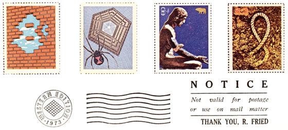
A 1971 “issue” presents naught but a brick wall - with certain bricks removed to form an “8c” (yes, there are two bricks floating where the holes of the 8 should be) and revealing blue sky behind. If I recall correctly, Fried deliberately or accidentally passed a letter in the mails using one of his own stamps as U.S. postage, and was convicted of defrauding the post office. I don’t know if he served any sentence, but his stamp images - chains breaking in front of a jail cell window, collapsing “pillars of justice” - indicate that, like Farley, Fried was none too pleased with American justice at that time. Mellower and more positive images from 1973 - including one of Mick Jagger in concert - indicate that Fried was not motivated only by his own ire and sociopolitical beliefs.
Color plays an important role in the stamp art of another, living, American, E. F. Higgins III. Higgins, who also realizes his stamp images as oil paintings (perforated borders painted into the pictures), has of late been one of the most active stamp artists in the world, a veritable proselytizer for the stamp format. (He has also managed to convince the normally dour and intractable post office to allow him his own zip code-10000.) Higgins has found that the quickest way to print stamps, especially in color, is on a photocopy machine, specifically the Xerox 6500 Color Copier. The colors have a peculiar acid intensity, which only enhances the visual impact of Higgins’s stamps. These stamps - virtually all labelled “Doo-Da Post” - are in fact photo-reductions of Higgins’s paintings and drawings, which it turns out were done expressly to be turned in stamps. The images are crudely rendered (one might call them faux Fauve) but are highspirited and often sweet and funny. A recurring motif is a man’s head (Higgins’s own) crowned with a high bolt nut sprouting wings. (Wing nut, get it?) Higgins is also wont to spoof various art masterpieces, and to pay frequent homage to his mentors and comrades-in-arms in what he obviously perceives as an artists’ stamp-mail art “movement”. Among his heroes and pals are Ray Johnson (who has worked infrequently with stamps, except to create patterns with 1c stamps on his New York Correspondance School mailings), Buster Cleveland (“O.K.Post”), Rose Avery [no-nuke], Patrick Beilman (“Cow Town Art” out of Milwaukee), Harley Francis (“Tristan Local Post” from Oberlin, Ohio) [“Terra Candella”], Carl T. Chew, and Guglielmo Achille Cavellini.
Along with Higgins, Cleveland, Avery, and Beilman, Philadelphia artist Suzanne Horvitz - often joined by her fellow artist (and Synapse Press co-director) Sandra Lerner - has come to employ the photocopy machine to make her stamps - which are stamps made from stamps. Horvitz collages images from sources that are frequently at least as, er, colorful and provocative as Bob Watts's, often photocopying them deliberately off-register and just as often mounting them in albums which are exhibited as integral artworks. And, with regard to stamps in color (and stamps off color), one of the most spectacular sheets of artists’ stamps was produced in 1975 by China-born New Yorker Wallasse Ting, who transferred a sequence of lushly, brilliantly colored paintings of sexy female figures to the offset stamp format.
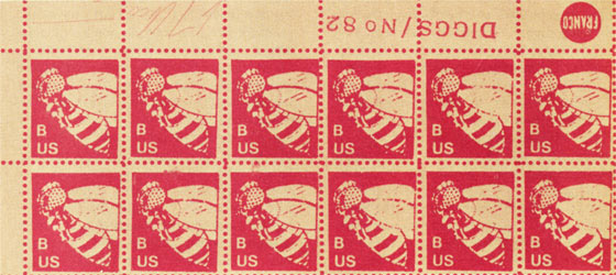
Carl Chew (sic), a Seattle artist, turned to the Xerox 6500 for the express purpose of making stamps about the same time as, but independent of, Higgins. Most of Chew’s stampwork comes out of his involvement with extensive narratives of his own invention, narratives which he also sustains in other media, more traditional and less. One of Chew’s most brilliant fantasies concerns Edwin R. Diggs, the “Hermit of Patagonia”, whom Chew credits with inventing the food stamp. Poor Diggs went on to design hundreds of stamps, none of which the American government ever used. His last design, illustrated here, was submitted to the Post Office only moments after the non-denominational “A” stamp was approved. As Chew recounts, Diggs had faced this kind of failure before, but the episode left him unable to revive any of his old fantasies. He became so preoccupied with improving the “B” stamp so that no one could refuse it The stamps took on gross misshapen forms and wild vivid colors danced across the sheets. Feeling that his rejection was now overwhelming Edwin booked passage on a freighter to Patagonia. Here he lived and worked among the gentle natives, and tried to interest them in his stamps. Perhaps this final effort brought him some degree of happiness. We shall never know. On the morning of July 4th, 1978, Edwin Diggs walked into the thick jungle surrounding his studio. He has not been seen since.
Among other inspirations of Chew’s are stamps - and other objects - documenting and commemorating his Video Dig project. (Which “assumed we lived in the future and an interesting discovery of a video culture was unearthed in Western Washington”) and mail, festooned with various of Chew’s postal conjurations, “discovered” in some “long lost international pouch” and finally en route to its addressees several decades after the fact.
G.A. Cavellini’s stamps are involved in a different kind of fiction. Cavellini, a wealthy older man who resides in Brescia, Italy, has been engaged over the past few years in a sometimes hilarious, sometimes off-putting aggrandizement of his own role in art history. His books advance patently ersatz documentation and testimony concerning his importance (virtually proclaiming him an old master before his time), and stickers. banners, and other public signs have announced “centennial retrospectives” (in the year 2014, mind you) at various of the world’s most important museums. At its best, Cavellini’s whole megahype becomes a meta-hype, a burlesque on the aspirations and dreams of every artist and on the mechanisms such an artist hopes (against hope) to subjugate to the needs of his or her career. Cavellini’s stamps, all labelled “international postage” and given the denomination 333 (in fact the name of the chain of food mini-markets from which he derives his fortune), bear this retrospective information and various photographs of the man himself (on occasion juxtaposed with van Gogh’s self portrait or some other old master reference).
Cavellini is one of Europe’s most ubiquitious stamp artists. He has the resources to circulate his stamps, and other publications, all over creation. (His books are not sold, but sent free to whoever requests them, and to many who don't.) Other artists in Europe, as in America, aren’t so fortunate, but they do well enough.
Peter Below’s handsome photoimage “Ego-Post” stamps from Germany, for instance, or the stamps by various artists published by John Armleder at Ecart in Geneva, are circulated broadly. But this is more at the discretion of the artist or publisher and his energy than of the artist’s pocketbook - or government.
Artists in the socialist countries of eastern Europe have a harder time of it, but certain citizens of the People’s Republics, at least, find their postal services tolerant of their shenanigans. Hungary’s Endre Tot - whose Zeropost sheet was published by Ecart - manages to mail his euphoric zero-mail from Budapest to the world, and Poland’s Pawel Petasz and Henryk Bzdok barrage favored recipients with all manner of publications, stamps - both postage and rubber - not least among them. Petasz’s stamps, like much of his awkwardly printed but extravagantly designed material, is rich in expansive good spirits. The heady simple (often simple-minded) faith in mail art that many European artists proclaim (in sometimes painfully broken English) seems not only genuine but fervently ethical in Petasz’s case.
To judge from the Vancouver catalogue, Europe lags behind Canada and the United States in artists’ stamp activity. The information provided by Carrión’s Amsterdam show brought matters up to date somewhat, and it must be recognized that neither exhibit has pretended to be an exhaustive compendium. But from all indications, concentrated stamp activity in Europe pretty much postdates that in North America. The 1960’s featured only the usual Fluxus-related individuals, and the early 1970’s were hardly more varied and active. Isolated items such as German Stefan Wewerka’s postcards with his own stamps on them - both cards and stamps slanted as if seen in rapid motion (the stamps bearing images of road signs) - have come to my attention, and without doubt more additions and emendations to the history of stamp art wait to come from or be found in Holland, Yugoslavia, Denmark, and Spain. ART EXPRESS News Editor Judith Hoffberg recently sent my way a delectable drawing-on-a-stamp by the Swiss Regula Huegli, apparently the exemplar of a series of recycled stamps (and envelopes) which Huegli has been garlanding for years with natural and mythical symbols and human faces.
If European artists have been slow to come to stamps - surprising in light of their widespread involvement since Fluxus days in mail art generally - there are indications that they are making up for lost time. The last three numbers of the revue Doc(k)s , edited in France by visual-sonic poet Julien Blaine, have featured an ongoing selection of artists’ stamps, with the selection weighted (by chance) towards Europe. The reproductions are relatively crude (although the magazine itself is handsomely produced), but yield enough visual information to testify to an artists’ stamp explosion - fed and perhaps even ignited by Blaine’s attention - over there. Printed stamps, hand-rendered stamps, collaged stamps, altered “real” stamps, commentary on stamps and “stampness”, and manipulations of the function of the postage stamp which echo Yves Klein’s gutsy gesture pour out of European countries, capitalist and communist alike. Holland’s Ko de Jonge, Johan van Geluwe, and Peter van Beveren, for instance, or Hungary’s Gabor Toth and Balint Szombathy**; Klaus Groh, Horst Hahn, and Robert Rehfeldt in West Germany; Vittore Baroni, Betty Danon, and Mohammed (Plinio Mesciulam) in Italy; Yugoslavia’s Miroljub Todorovic, Czechoslovakia’s Katalin Ladik**, and France’s Joël Hubaut (as well as Blaine lui-meme) tumble in the international mail sack of Doc(k)s’s stamp-art albums with their compeers from Europe and America.
When I say “America” I mean both continents, North and South. Only the tip of an apparent iceberg of artists’ stamp activity south of the border has been sighted from these vantages. A sequence of world-wide stamp compendia, Our International Stamps/Cancelled Seals, continues to be edited by G. E. Marx Vigo of Argentina, probably South America’s most active maker and publicizer of artists’ stamps. His countryman Guillermo Deisler and the Brazilian Leonhard Frank Duch appear in Marx-Vigo’s books and in Doc(k)s, and sheets of stamps by Mario N. lshikawa were among the most intriguing items in a show of Brazilian conceptual art. organized by Regina Vater, in New York two seasons back. These examples seem to indicate the likelihood of more South American stamp activity, and, if that activity is in tenor anything like the rest of South American non-studio art, it is or will be especially witty, eloquent, and socially sensitive.
A whole other range of stamp art opens up when one considers the postage stamp as an item of collage - or as an image removed from function, like Alex Hay’s Green Stamp. Indeed, Michael Busch, a New York painter, has created a Pop-like series of paintings of stamps, taking great care to capture every graphic nuance of the stamp’s physical properties. More important is the nature of the imagery Busch amplifies by expanding the scale of pre-extant stamps. Several of his paintings are of African colonial stamps, depicting a “typical” colonized native. Several others are of stamps from mainland China issued during the height of Xiang Qing’s cultural puritanism, and they depict the requisite merry tractor driver, the dedicated peasants working in the communal rice paddles, and other pictorial clichés of Marxist-Leninist-Maoist thought. More powerful yet, and disturbing, are of Busch’s renditions of Nazi German stamps - the grim profile of Hitler an all-too-recognizable and all-too-dominant leitmotif. (These paintings, in turn, recall the 1967 Deutsche Werk by the Fluxus-associated German K.P.Brehmer, in which stamps bearing Hitler and swastika images are cancelled with a caustic yet hopeful finality.) Ultimately, however, Busch is motivated by a philatelic fascination with the gestalt of the postage stamp, with its function and its feel; only a stamp-loving artist could have printed up Busch’s exact-scale replicas of various European sheets and plate blocks (from a Hitler 12 Pfennig orange to a Russian Imperial 3 kopeck red with stops along the way at the inflationary issues of the Weimar republic and other historically telling and graphically fascinating items) without perforation and on totally neutral, relatively cheap paper, so that the sheet is no longer just a sum of identical parts.
Michael Busch’s “Montenegro” is a painting inspired by an actual turn-of-the-century stamp from a no longer existent Balkan country.
Those artists who incorporate postage stamps into collages tend to be milder about the stamps’ associations. Still, the presence of stamps always provokes some thought. Stephanie Kirschen Cole, working in upstate New York, places stamps in formally crucial spots within her delicate drawing-watercolors, attracting our attention to them iconically as well as graphically. One doesn’t need to be told that these stamps mean something to her, even if it’s just the memory of a parent’s or dear friend’s letter from afar. Collaged images printed up as stamps work in a reverse manner, emphasizing the depictive, not the formal nor the associative. The stamps of May Wilson and George Ashley, both prominent in Felter’s exhibit, contain typical “important” figure images - monarchs, allegorical figures, historic statesmen - with the artist’s head interposed for that of the original image. Pat Tavenner’s stamps from about the same time (1973) do not exploit the same photomontage technique; she merely superimposes labels (“Artist of Unknown Media”, “Mail Queen”, “Charm School”) over photographs of herself, reduces the results to stamp size, and perforates. But Tavenner’s stamps address the same mid-70s “me-art” ideas in the same insouciant, self- and society-mocking manner as Ashley’s and Wilson's. Klaus Groh’s skin mag centerfold collages turned into stamps are similarly light commentaries on fetishistic voyeurism (an incidental jab at philatomania, I'd wager). For purely formal beauty rendered with collage techniques in and on stamps. it’s hard to beat the numerous painstaking patchworks of Englishman Jack Milroy; working with sheets and sheets of common one-color small-denomination Queen Elizabeth II issues, Milroy introduces morsels of each sheet into every other, creating multicolor (and multidenomination) crazy quilts where once had been fields of incessant pink or nagging green.
What makes artists turn to the postage stamp as a viable format for artistic exploration and expression? The social ramifications of the postage stamp are fairly obvious: it is an emblem of governmental control with which everybody comes into contact. The aesthetic motivations are somewhat less universal - and are usually obscured rather than elucidated when Famous Works Of Art are reproduced on a country’s stamps. Stamps - whether vested with sociopolitical symbolism or not - are self-contained image-fields, like paintings or photographs but far more intimate and (necessarily) tactile. There are few art objects more within reach of anyone and everyone than stamps - and when I say anyone and everyone, I include young children with their impressionable minds and voracious sensibilities. “Ever since I ruthlessly squandered some of my grandfather’s most valuable stamps at junior high stamp club for small change and ice cream”, Carl Chew has written me, “I have been interested in making stamps.” Even more telling than this admission of childhood guilt was what Michael Busch said to me at the end of my visit with him: “These were the images I saw as a child. I thought art was stamps.”
Partly because of space and partly because there is just no way to keep fully abreast of stamp art activity throughout the world - even maintaining an internationally known stamp art collection, as James Feller does at Simon Fraser University - my survey of artists’ stamps barely scratches the surface of this delightful phenomenon. As well it should.
The artists’ stamp format is perhaps a more codified, better defined, and physically somewhat more permanent medium than most mail art, but it partakes of the same ephemeral aesthetic. Stamps, after all, are more likely to end up on envelopes that are ultimately discarded than they are framed on someone’s wall. And it can be presumed that, for the most part, those artists who make stamps make them to be used as stamps. They may be artworks, but they're the only artworks I know of with gum on their backs. Likewise, it is improbable that I have come near to exhausting the range of artists concentrating on the use of stamps in “traditional” collage. But that just leaves the door open for more discoveries. Following artists’ stamps combines the thrill of two hunts: the philatelic and the artistic. It’s the only way to travel.
Then, of course, there’s artists’ money...
** Bálint Szombathy and Katalin Ladik are artists living and working in Yugoslavia (correction by Artpool) <>
* This essay was published in:
Art Express, 1981 May
World Art Post, Artpool, Budapest, 1982, pp. 1-4. <>
[WAP texts]